Acorns Among The Pumpkins
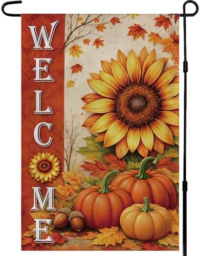
The illustration piles up the season's props: two or three pumpkins at the base, one open sunflower, colored maple leaves and a pair of acorns tucked in near the edge. Acorns are the detail that tends to be missing from harvest artwork, and they are what stops the design from reading as a Halloween flag. The colors stay in orange, gold and brown.
A Greeting Read Downward
Bold vertical type gives every letter the full width of the panel, so WELCOME stays readable from a car slowing at the curb rather than shrinking to fit. Because the printing goes through to the reverse, the word runs the right way on both sides and nobody sees it backwards from inside the house. It is a greeting rather than a joke, which suits a front step that stays dressed for two months.
Standing Up To November
Autumn ends wetter and colder than it starts, and the panel is made for the back half of it. The polyester has a burlap-like texture but none of the rot, so frost mornings and a week of rain leave it intact and the print stays saturated instead of turning pale. If the weather gets serious the flag comes off the stand in a second and goes back on when it clears.
Above The Mums
Porch decorating usually happens in layers, and this is the vertical piece in it. A stand planted at the edge of the walk lifts the design above a row of mums, a stack of hay bales or the crate of gourds that sits by the steps. On a patio it does the same job beside a pair of chairs, and one flag replaces the seasonal sign a lot of households hang on the door.